Under media, you can find some of the media-related styles and utilities.
Images
In Spruce, we use a general responsive styling for all images. We also disable the user-select
.
cssimg { display: block; height: auto; max-width: 100%; user-select: none;}
Figure
To create an image caption, use the figure
and figcaption
element with the .figure
and .figure-caption
.
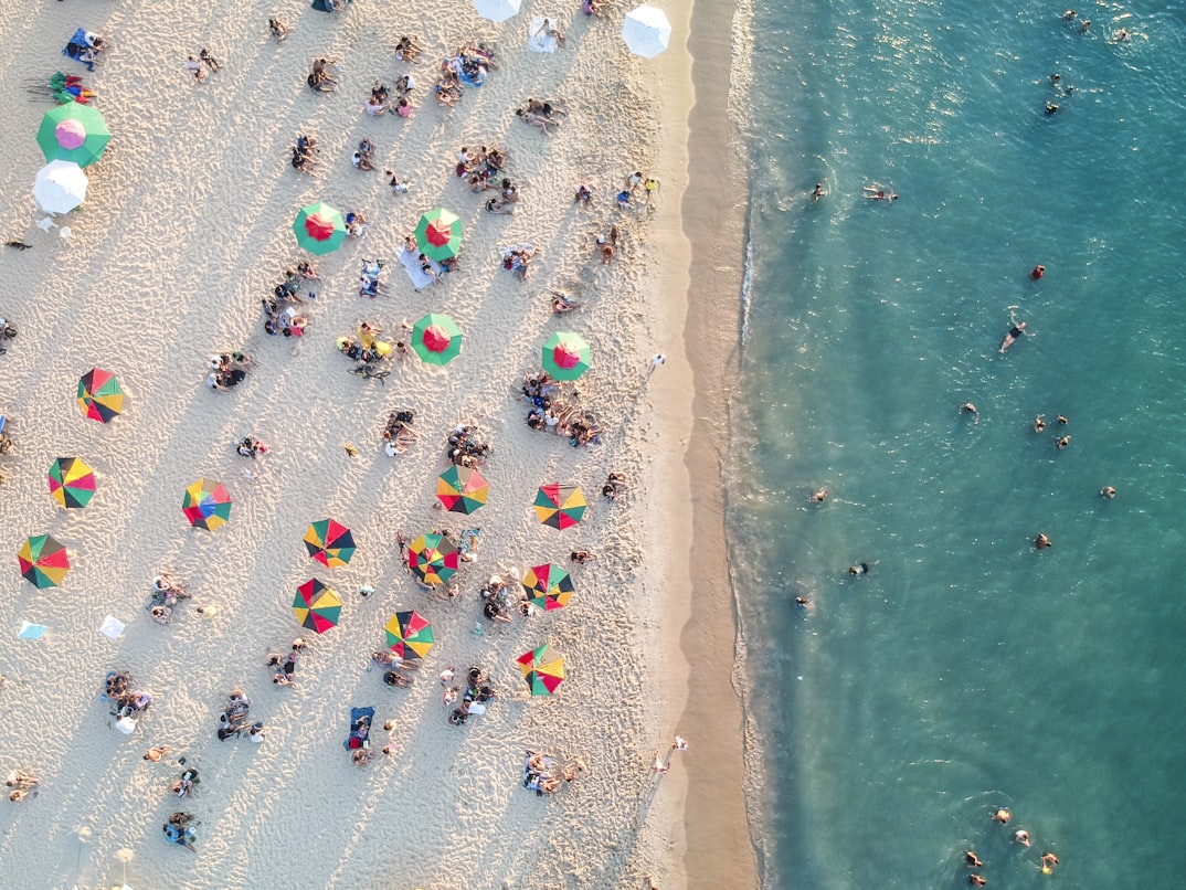
html<figure class="figure"> <img src="..." alt="..."/> <figcaption class="figure-caption">The beach where we were sunbathing last summer.</figcaption></figure>
Containers with Aspect Ratio
With embedded iframes, the responsivity doesn’t work. We used to need hacks to achieve and mimic an aspect ratio (e.g., in the case of YouTube videos), but today we have a CSS property named aspect-ratio.
For this purpose, we have some utility named:
aspect-ratio-16-9
aspect-ratio-4-3
aspect-ratio-1-1
html<div class="aspect-ratio-16-9"> <iframe width="560" height="315" src="https://www.youtube.com/embed/-6Xl9tBWt54" title="Lordi - Hard Rock Hallelujah" frameborder="0" allow="accelerometer; autoplay; clipboard-write; encrypted-media; gyroscope; picture-in-picture" allowfullscreen="allowfullscreen"></iframe></div>
html<div class="aspect-ratio-4-3"> <iframe src="https://www.google.com/maps/embed?pb=!1m14!1m12!1m3!1d41126.9496578375!2d17.890734642764393!3d46.95617814407089!2m3!1f0!2f0!3f0!3m2!1i1024!2i768!4f13.1!5e0!3m2!1shu!2shu!4v1646924792947!5m2!1shu!2shu" width="600" height="450" style="border:0;" allowfullscreen="allowfullscreen" loading="lazy"></iframe></div>
Please note that you must explicitly enable this using the utilities switch under the $settings
map.