@use 'sprucecss/scss/spruce' as *;
.projects-block {
padding-block: spacer-clamp('xl', 'xxl');
&__inner {
display: flex;
flex-direction: column;
gap: spacer-clamp('l', 'xl');
}
&__header {
align-items: end;
display: flex;
flex-wrap: wrap;
gap: spacer('m');
justify-content: space-between;
}
&__list {
display: flex;
flex-direction: column;
gap: spacer-clamp('l', 'xxl');
list-style: none;
margin: 0;
padding: 0;
}
&__project {
@include a11y-card-link('.projects-block__link', true);
align-items: center;
display: grid;
gap: spacer-clamp('m', 'xl');
@include breakpoint('md') {
grid-template-columns: minmax(0, 3fr) minmax(0, 2fr);
li:nth-child(even) > & {
grid-template-columns: minmax(0, 2fr) minmax(0, 3fr);
.projects-block__media {
order: 1;
}
}
}
}
&__media {
aspect-ratio: 3 / 2;
background-color: color('surface-muted');
border-radius: radius('lg');
overflow: hidden;
img {
block-size: 100%;
inline-size: 100%;
object-fit: cover;
}
}
&__content {
@include layout-stack('s');
}
&__meta {
color: color('muted');
font-size: config('font-size-sm', $typography);
font-weight: 700;
letter-spacing: 0.06em;
text-transform: uppercase;
}
&__title {
font-size: responsive-font-size(2.25rem, 30, '2vw + 1rem');
text-wrap: balance;
}
&__link {
color: inherit;
text-decoration: none;
}
&__text {
color: color('muted');
}
&__tags {
display: flex;
flex-wrap: wrap;
gap: spacer('xxs');
list-style: none;
padding: 0;
> li {
margin-block: 0;
}
}
&__metric {
align-items: baseline;
border-block-start: config('border-width-base', $display) solid color('border');
color: color('muted');
display: flex;
gap: spacer('xs');
padding-block-start: spacer('s');
strong {
color: color('primary');
font-family: config('font-family-heading', $typography);
font-size: font-size('h2');
}
}
&__more {
align-items: center;
color: color('primary');
display: flex;
font-weight: 700;
gap: spacer('xs');
.block-icon {
block-size: 1.1rem;
inline-size: 1.1rem;
}
}
&__project:hover &__link,
&__project:focus-within &__link {
text-decoration: underline;
}
&__project:focus-within {
.projects-block__media {
outline: 3px solid color('focus-ring');
outline-offset: 3px;
}
}
@include motion-safe {
&__media img {
transition: scale 0.4s ease;
}
&__more .block-icon {
transition: translate 0.2s ease;
}
&__project:hover {
.projects-block__media img {
scale: 1.03;
}
.projects-block__more .block-icon {
translate: 0.25rem 0;
}
}
}
}
[dir='rtl'] .projects-block__more .block-icon {
scale: -1 1;
}
@media (prefers-reduced-motion: no-preference) {
[dir='rtl'] .projects-block__project:hover .projects-block__more .block-icon {
translate: -0.25rem 0;
}
}
<section class="projects-block" id="work" aria-labelledby="projects-title">
<div class="container">
<div class="projects-block__inner">
<div class="projects-block__header">
<header class="block-heading block-heading--start">
<p class="block-heading__eyebrow">Selected work</p>
<h2 class="block-heading__title" id="projects-title">Products I’ve helped ship</h2>
</header>
<a class="btn btn--outline-primary" href="#">See the full archive</a>
</div>
<ol class="projects-block__list" role="list">
<li>
<article class="projects-block__project" aria-labelledby="project-1-title">
<div class="projects-block__media">
<img src="https://images.unsplash.com/photo-1563986768609-322da13575f3?auto=format&fit=crop&w=1200&q=70" alt="The Fjord Bank app on a phone." loading="lazy" width="1200" height="800">
</div>
<div class="projects-block__content">
<p class="projects-block__meta"><span>Fjord Bank</span> <span aria-hidden="true">·</span> <time datetime="2025">2025</time></p>
<h3 class="projects-block__title" id="project-1-title"><a class="projects-block__link" href="#">A banking app people actually enjoy</a></h3>
<p class="projects-block__text">A ten-year-old product, simplified: new navigation, a calmer visual language and an accessible component library.</p>
<ul class="projects-block__tags" role="list" aria-label="My role">
<li class="badge">Research</li>
<li class="badge">Product design</li>
<li class="badge">Design system</li>
</ul>
<p class="projects-block__metric"><strong>−33%</strong> support tickets</p>
<p class="projects-block__more" aria-hidden="true">Read the case study <svg class="block-icon" xmlns="http://www.w3.org/2000/svg" viewBox="0 0 24 24" fill="none" stroke="currentColor" stroke-width="2" stroke-linecap="round" stroke-linejoin="round" aria-hidden="true" focusable="false">
<path d="M5 12h14"/><path d="m12 5 7 7-7 7"/>
</svg>
</p>
</div>
</article>
</li>
<li>
<article class="projects-block__project" aria-labelledby="project-2-title">
<div class="projects-block__media">
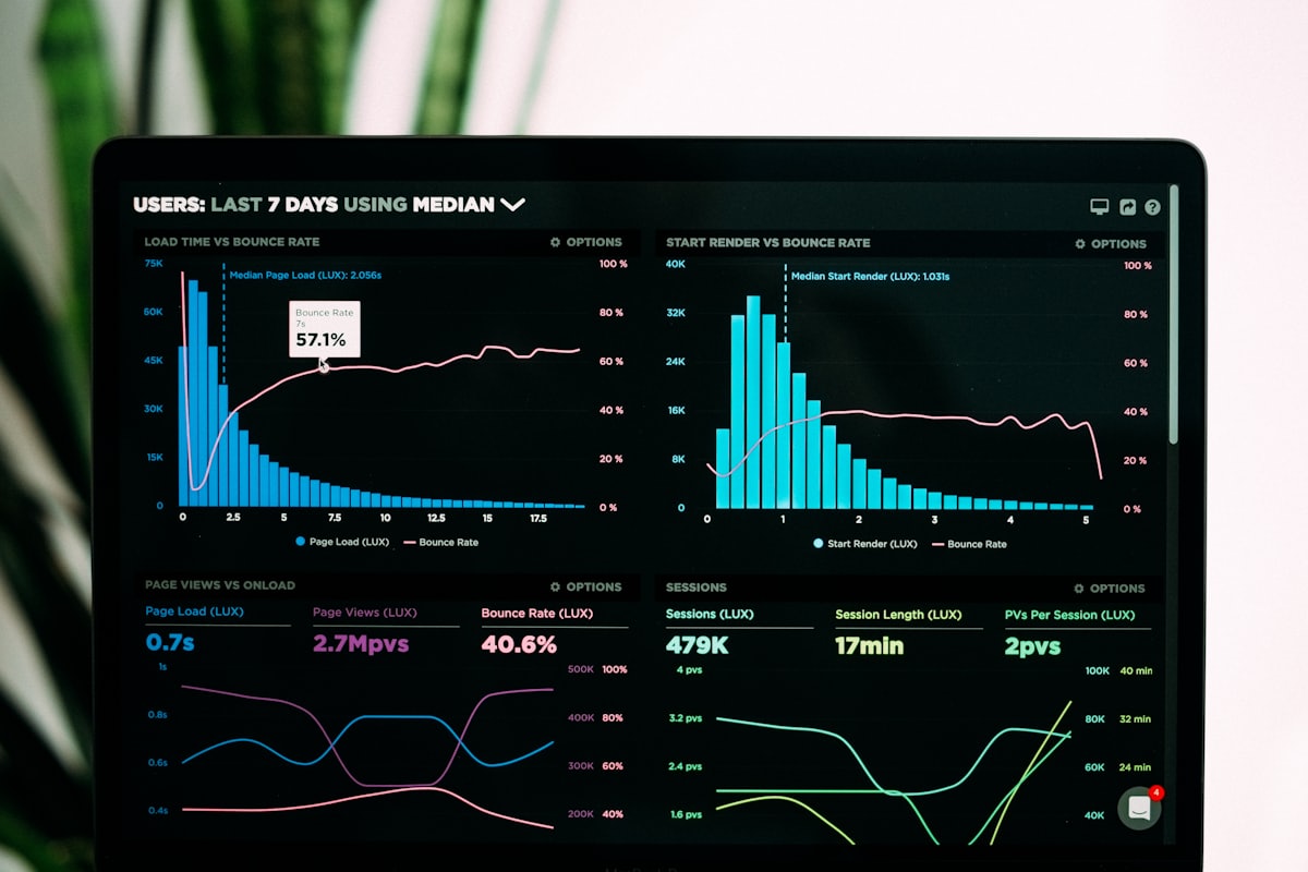
<img src="https://images.unsplash.com/photo-1551288049-bebda4e38f71?auto=format&fit=crop&w=1200&q=70" alt="The Lumen dashboard with charts on a laptop." loading="lazy" width="1200" height="800">
</div>
<div class="projects-block__content">
<p class="projects-block__meta"><span>Lumen</span> <span aria-hidden="true">·</span> <time datetime="2024">2024</time></p>
<h3 class="projects-block__title" id="project-2-title"><a class="projects-block__link" href="#">Analytics that answer questions</a></h3>
<p class="projects-block__text">From 40 charts to six answers: a dashboard redesign built around the questions customers really ask.</p>
<ul class="projects-block__tags" role="list" aria-label="My role">
<li class="badge">Product design</li>
<li class="badge">Prototyping</li>
</ul>
<p class="projects-block__metric"><strong>2.4×</strong> weekly active users</p>
<p class="projects-block__more" aria-hidden="true">Read the case study <svg class="block-icon" xmlns="http://www.w3.org/2000/svg" viewBox="0 0 24 24" fill="none" stroke="currentColor" stroke-width="2" stroke-linecap="round" stroke-linejoin="round" aria-hidden="true" focusable="false">
<path d="M5 12h14"/><path d="m12 5 7 7-7 7"/>
</svg>
</p>
</div>
</article>
</li>
<li>
<article class="projects-block__project" aria-labelledby="project-3-title">
<div class="projects-block__media">
<img src="https://images.unsplash.com/photo-1512941937669-90a1b58e7e9c?auto=format&fit=crop&w=1200&q=70" alt="The Hearth booking app on a phone." loading="lazy" width="1200" height="800">
</div>
<div class="projects-block__content">
<p class="projects-block__meta"><span>Hearth</span> <span aria-hidden="true">·</span> <time datetime="2023">2023</time></p>
<h3 class="projects-block__title" id="project-3-title"><a class="projects-block__link" href="#">Booking a home in three taps</a></h3>
<p class="projects-block__text">A new booking flow for a holiday rental startup, tested with 60 guests in four countries.</p>
<ul class="projects-block__tags" role="list" aria-label="My role">
<li class="badge">Research</li>
<li class="badge">Mobile</li>
</ul>
<p class="projects-block__metric"><strong>+18%</strong> completed bookings</p>
<p class="projects-block__more" aria-hidden="true">Read the case study <svg class="block-icon" xmlns="http://www.w3.org/2000/svg" viewBox="0 0 24 24" fill="none" stroke="currentColor" stroke-width="2" stroke-linecap="round" stroke-linejoin="round" aria-hidden="true" focusable="false">
<path d="M5 12h14"/><path d="m12 5 7 7-7 7"/>
</svg>
</p>
</div>
</article>
</li>
</ol>
</div>
</div>
</section>